The Variance Mountain
TL;DR When looking at good companies the shape is a slope and in bad companies it looks like a mountain.
An often-overlooked dimension of this is the shape or distribution of the variance across topical areas, and the scores your customers have given you. When you look at the data, through this lens, things become apparent. For influential companies with happier customers, the shape of their variance is a slope while it looks like a mountain if your customers are unhappy.

Looking at this, it makes sense at a basic level. As Tolstoy proclaimed, “All happy families are alike; each unhappy family is unhappy in its own way.” People that leave good reviews need to say something, and invariably it will be a lot of the same, things that go right go right for the same reasons. Whether through excellent service, a good product, or meeting a commitment, people will be happy in the same ways.
When it comes to things going wrong, though, they tend to go wrong differently.
Take a topic like Delays. Intuitively we know many people will be unhappy about a delay, but we also know that the negative of a delay will correspondingly provide a company with a chance to create a good impression by solving the problem. One high scoring comment read,
“Check-in was easy; the flight was delayed by about 20 minutes, so we assumed we would be arriving in Orlando about 20 minutes late… HOWEVER, our pilot put the engines in “afterburner,” and we arrived 22 minutes early and about 5 minutes ahead of some severe thunderstorms!”
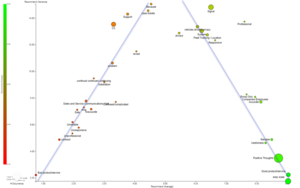
This is a perfect example of a negative experience giving a company a chance to make a positive impression. It drives variance higher in negative topics and creates the upper left to lower right trend we see across industries and data sets. This trend is also present in our dataset assembled from over 5000 hotel reviews. This is true when charting the average CSAT score against the variance score.
This again depicts the sharp upper left to lower right trend, indicating that lower-scoring NPS topics have high variance and high NPS topics have low variance values. One high variance topics in the data was ‘booking related comments,’ and it’s easy to see why booking problems can be an opportunity to overcome or fail, and why there is a wide discrepancy in scores.
“We booked a suite, and it was never given to us. They were so rude and refused to act as if they had a suite. After 6 hrs of travel, they did not care about their mistake. I would never stay here again.”
“My wife and I arrived about 2 hours ahead of the check-in time, and they were completely booked, we had a reservation, but we were early. They found us a room, and it was amazing. They have valet that’s owned by another company they are really expensive but worth it if you’re driving like we were.”
These examples highlight the natural variability of customers discussing booking related issues, and while all businesses strive to turn problems into opportunities, and it is natural not to bat a hundred percent on those opportunities. There is, however, a second possibility, when you have topics with low NPS and low CSAT scores that also have low variance. It would represent a more negative hypothesis that your company has issues where they are consistent and bad. This sort of chart would look different, more like a mountain than a ski slope. With this in mind, let’s take a look at a quick plot of NPS for a telecom companies product (left chart).
This shows the telecom data with a standard OLS regression that basically tells us nothing due to the scattered nature of the data. However, when I break the data set in half at an NPS score of 5 and run two regressions, the results are starker.
This chart clearly shows their most negative topics in terms of NPS are also tied with the most positive topics for being the lowest in their variances. Not only are they doing things their customers dislike, but they are also consistent and repeatable with these actions.
It represents the worst type of opportunity, a squandered one.
When plotting your variance data, it is essential to realize that high variance isn’t always a bad thing; it can be a positive sign that the steps you have taken to address known problems are working. Remember, a low variance is not always good either; the only thing worse than being bad at something is being consistently bad at something!